02-datavis-7ways
02-DataVis-7ways
Assignment 2 - Data Visualization, 7 Ways
I have visualized given data set in 11 ways. These features are totally preserved in my replication:
-
Data positioning: it should be a downward-trending scatterplot as shown. Weight should be on the x-axis and MPG on the y-axis.
-
Scales: Note the scales do not start at 0.
-
Axis ticks and labels: both axes are labeled and there are tick marks at 10, 20, 30, etcetera.
-
Color mapping to Manufacturer.
-
Size mapping to Weight.
-
Opacity of circles set to 0.5 or 50%.
-
Grid.
Furthermore, legends and background color are preserved in most replications.
Libraries, Tools, Languages
The libraries, tools and languages I’ve used are as follows.
7 libraries and 3 languages:
- ggplot2 + R + R Markdown
- d3 + JavaScript
- Vega-lite + JavaScirpt + JSON
- Matplotlib + Python
- mpld3 + Python
- Seaborn + Python
- Bokeh + Python
4 tools:
- Tableau
- Flourish
- PowerBI
- Google sheet
Catalog
3. Vega-lite + JavaScirpt + JSON
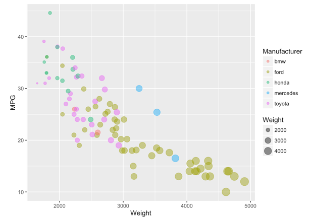
1. R + ggplot2 + R Markdown
Page link: https://junying-li.github.io/02-datavis-7ways/ggplot2/index.html
R is a language primarily focused on statistical computing. ggplot2 is a popular library for charting in R. R Markdown is a document format that compiles to HTML or PDF and allows you to include the output of R code directly in the document.
To visualized the cars dataset, I made use of ggplot2’s geom_point() layer, with aesthetics functions for the color and size.
While it takes time to find the correct documentation, these functions made the effort creating this chart minimal.
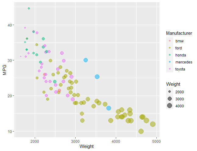
2. d3 + Javascript
Page link: https://junying-li.github.io/02-datavis-7ways/d3/index.html
D3.js is a JavaScript library for manipulating documents based on data.
There are 2 problems in our data set. First one is some columns in ‘MPG’ are NaN values. Second one is the type of values in our data set is string, we need to convert them into integer before visualizing.
To solve the first problem, I defined a filter function and made use of data.filter() to remove columns with NaN value.
For the second problem, I made use of + to convert string into integer. For instance, d.Weight = +d.Weight;.
I also set up background color and grid to make it looks like the given picture more.
In d3, we need to handle with every elements by our own. It has the longest code in all of my 10 ways to visualize. But on the other hand, it’s also more flexible. We can do much more things in different ways.
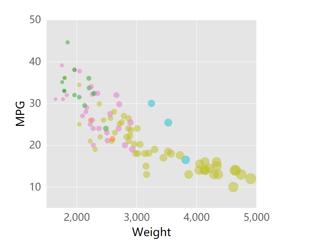
3. Vega-lite + JavaScirpt + JSON
Page link: https://junying-li.github.io/02-datavis-7ways/Vega-Lite/index.html
Vega-Lite is a high-level grammar of interactive graphics. It provides a concise, declarative JSON syntax to create an expressive range of visualizations for data analysis and presentation.
Vega-Lite has an online editor, which is very convenient to write JSON and also run it. We can also embed the JSON to html by using vegaEmbed(). I provided both JSON file and html file.
It’s very easy to visualize data with Vega-Lite. We just need to put data into its JSON syntax, then we will get a nice visualization. In addition, it can filter invalid values and set legends as well as grid automatically, which saved a lot of time.
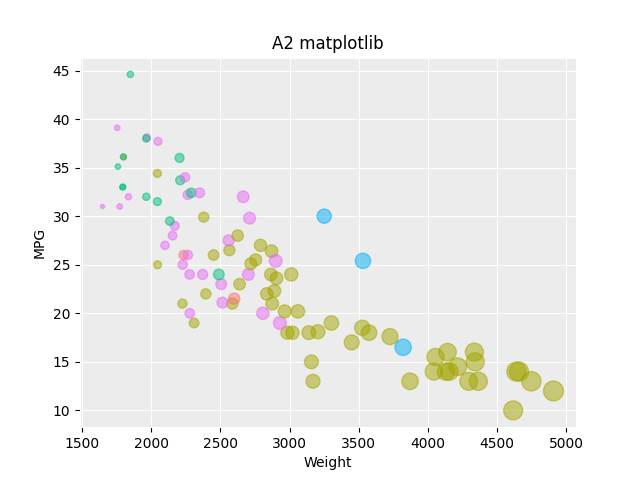
4. Matplotlib + Python
Page link: https://junying-li.github.io/02-datavis-7ways/matplotlib/index.html
Matplotlib is a plotting library for the Python programming language and its numerical mathematics extension NumPy. It provides an object-oriented API for embedding plots into applications using general-purpose GUI toolkits like Tkinter, wxPython, Qt, or GTK+.
I use pandas.read_csv() to load data. Then made use of notNull() to filter data and remove columns with NaN value. I also use map() to convert ‘Weight’ and ‘MPG’ data values from string to integer. When it comes to axes and grid, I made use of plt.rcParams[] to set. Finally, I use plt.scatter() to plot, and plt.show() to show result.
The pro of matplotlib is it has very powerful function of plotting and can be combined with data analysis. The con of matplotlib is that we can’t export results to web page directly, so I think it’s not very suitable for web based visualization development.
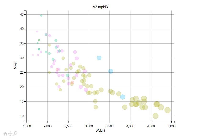
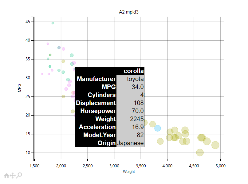
5. mpld3 + Python
Page link: https://junying-li.github.io/02-datavis-7ways/Mpld3/index.html
To solve the export problem mentioned above. I made use of mpld3 library.
The mpld3 project brings together Matplotlib and D3js. It can export your matplotlib graphics to HTML code which can be used within the browser, within standard web pages, blogs, or tools such as the IPython notebook. Graphics Exported by Mpld3 have tools below when mouse over it. Tools include box zoom, pan, and reset.
By using mpld3.show() can run a local server to show graphics on web page. I also used mpld3.save_to_html() to save a html file, which is Mpld3/index.html.
I also constructed an html tooltip, which can show all features of a data point when mouseover it.
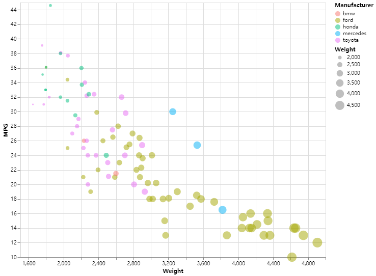
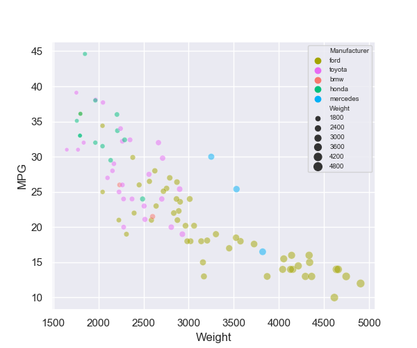
6. Seaborn + Python
Page link: https://junying-li.github.io/02-datavis-7ways/seaborn/index.html
Seaborn is a Python data visualization library based on matplotlib. It provides a high-level interface for drawing attractive and informative statistical graphics. I made use of seaborn.scatterplot() to plot graphics.
Both as visualization librarys, seaborn is much easier to use than matplotlib. It can filter invalid data, draw legends, set grid as well as background automatically. It’s even more comvenient than Vega-Lite. But we still need to import matplotlib while we use seaborn to plot, since we will use plt.show() to show result.
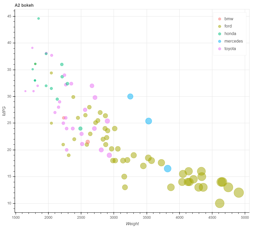
7. Bokeh + Python
Page link: https://junying-li.github.io/02-datavis-7ways/bokeh/index.html
Bokeh is a Python library for creating interactive visualizations for modern web browsers. It helps you build beautiful graphics, ranging from simple plots to complex dashboards with streaming datasets. With Bokeh, you can create JavaScript-powered visualizations without writing any JavaScript yourself.
Bokeh is very convenient to use too, meanwhile, it’s surprisingly easy to create html by it. Whatsmore, the graphic exported to html has a tool bar beside it. Tools include pan, box zoom, wheel zoom, save and reset.
We can simply use output_file("name.html") to export our graphics to html. Furthermore, bokeh can draw legends automatically as long as we have defined legend_group. I made use of factor_cmap() to set color mapping to Manufacturer, LinearInterpolator() to set size linear mapping to Weight.
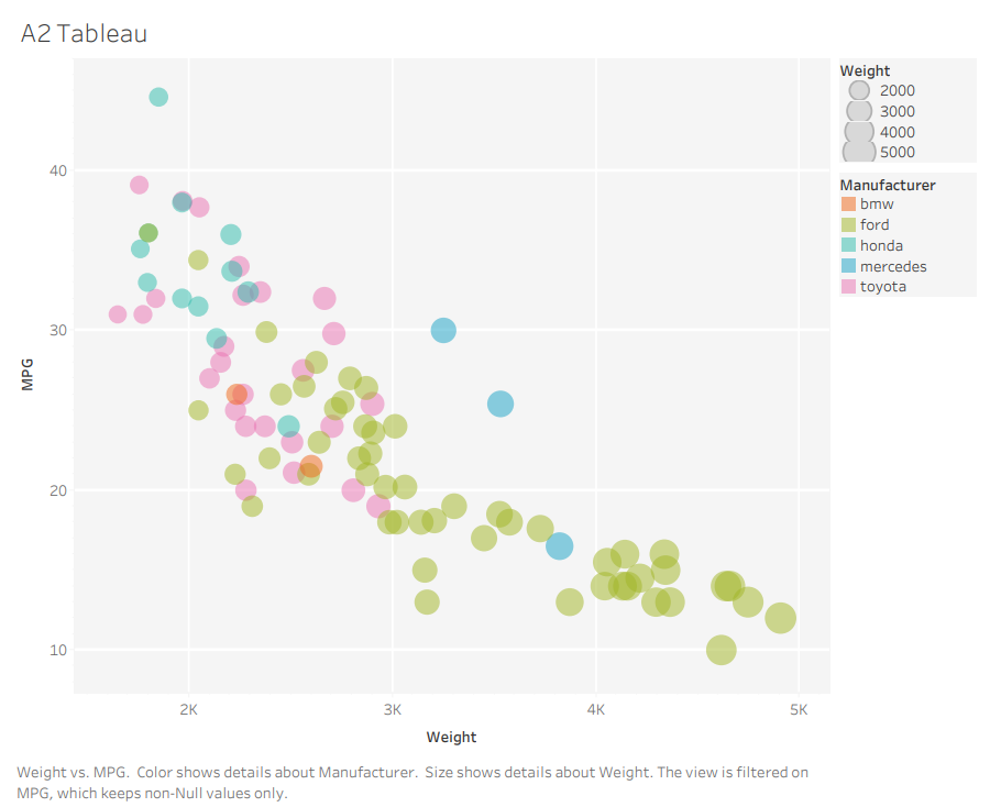
8. Tableau
Page link: https://junying-li.github.io/02-datavis-7ways/Tableau/index.html
Tableau is a powerful and fastest growing data visualization tool used in the Business Intelligence Industry. It helps in simplifying raw data in a very easily understandable format. Tableau helps create the data that can be understood by professionals at any level in an organization. It also allows non-technical users to create customized dashboards.
Tableau provides desktop application, online editor, and server, etc. It’s basically perfect for the non-technical users who want to visualize data, besides they need to pay for access.
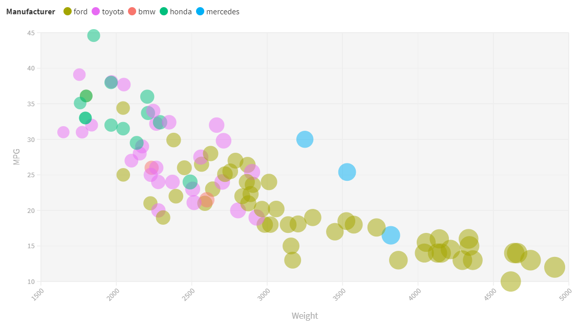
9. Flourish
Page link: https://junying-li.github.io/02-datavis-7ways/Flourish/index.html
Flourish is an online data visualization tool. It’s more easy to use than Tableau, and most importantly, it’s free. For individuals, Flourish is good enough. But for companies and organizations, Tableau is better.
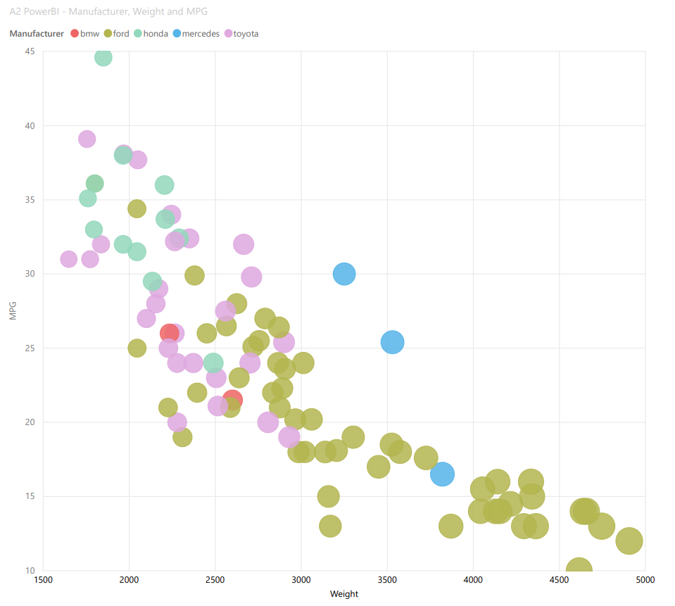
10. PowerBI
Power BI is a business analytics service by Microsoft. It aims to provide interactive visualizations and business intelligence capabilities with an interface simple enough for end users to create their own reports and dashboards.
PowerBI is free to use and does what it should as a data visualization tool. But publish work to internet needs Microsoft access. It seems that PowerBI was designed for companies and organizations, because individuals are not allowed to get access.
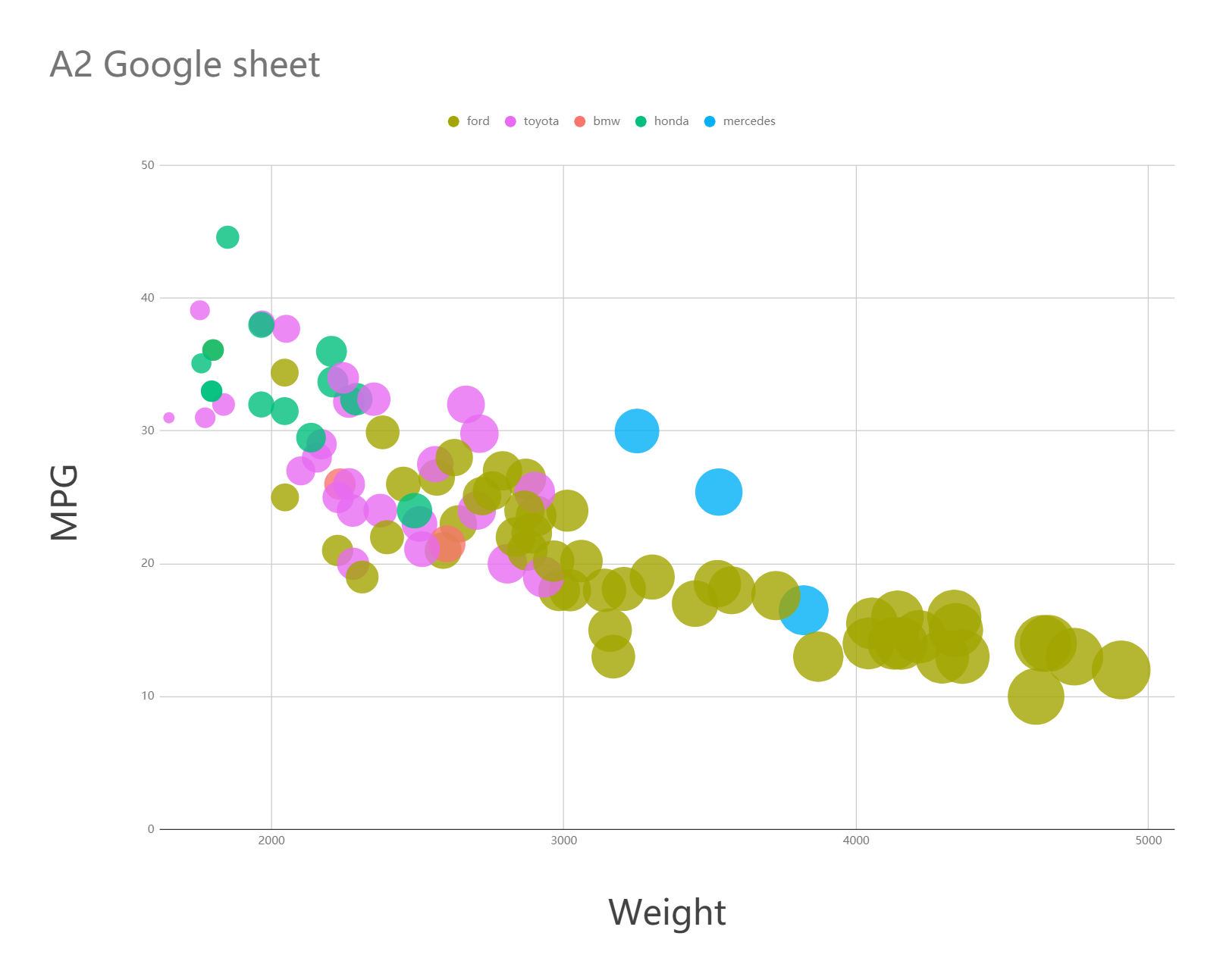
11. Google sheet
Page link: https://junying-li.github.io/02-datavis-7ways/Google%20sheet/index.html
Google Sheets is a spreadsheet program included as part of the free, web-based Google Docs Editors suite offered by Google. It’s like an online version of Excel, but much better than Excel in data visualization.
Technical Achievements
- Used 11 ways to visualize:
I used 11 ways to visualize given data set and each one meets the requirements. 3 languages (R, JavaScript, Python), 7 libraries (bokeh, ggplot2, matplotlib, mpld3, seaborn, vega-lite, d3) are used in my solutions. And I also made use of R markdown, JSON, and html. Besides, I chose 4 popular data visualization tools to draw graphics too.
- Constructed html tooltip:
To construct html tooltip, I made use of mpld3.plugins.PointHTMLTooltip(), which can define the html tooltip associated to the scatter plot. Then, connected tooltip to figure by using plugins.connect().
When mouseover a circle, there will be a tooltip shows all features of this data point.
Page link: https://junying-li.github.io/02-datavis-7ways/Mpld3/index.html
- Filtered Data:
In d3, matplotlib, and mpld3, I made use of different ways to filter data and remove columns with NaN value.
Design Achievements
- Color map:
I made color maps or palettes for each way in this assignment to make sure they look like the graphic given by the professor.
- Weight linear map:
In some ways of this assignment, the circles became too big after mapping to Weight. To make sure we have a better view, I set and adjusted parameters of linear mapping.